


(Click on the images to see enlargements.)
In July 2004 the Barbershop Harmony Society was in the process of updating its image to appeal to a new generation of singers. The board of directors began looking at proposals and wanted to get something from a member of the Society. I had done some work previously for the Society, including a logo for the Collegiate Quartet Contest, so I was asked to submit a design for consideration. This was an opportunity for me to help update the Society's graphic identity—something I'd been wanting to do for many years.
My underlying goal was to design an image that would be appealing to men of my generation and generations to come—something that I myself would feel proud to wear on a T-shirt, sweater, or anything else. I wanted to convey that this is a musical organization, without being so trite as to use literal musical symbols. If things went well, I wanted to end up with a graphic element that, in some way, represented four men singing. And it should be something that is easily recognizable without the name of the organization to identify it. I was also concerned to retain the dignity of the original Society logo. I didn't want this to look like a silly cartoon or some kind of extreme sport. It should be modern, but have a taste of classicality. It needed to be a distinguished, elegant design to represent a dignified art.
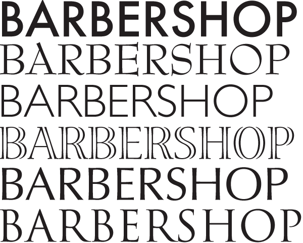
Figure 1
Being a calligrapher and typophile, I often begin design projects by choosing the right typeface. Every typeface has its own personality. The trick is to find the personality that fits your organization. I began by typing "Barbershop Harmony Society" and changing it from one typeface to the next, evaluating how the words felt clothed in each (figure 1). I didn't want it to be flippant or casual (Comic Sans), not plain or simple (Helvetica), and not too modern. What I was looking for was something that leant a feeling of dignity and respect to the name.
Finally, toward the bottom of my font list I came to a typeface that I really should have thought of from the start, one of my favorites by one of my favorite type designers. The Trajan typeface, created in 1989 by Carol Twombly for Adobe Systems, was based on the ancient Roman inscription at the base of Trajan's column, circa 114 C.E. What's beautiful about Trajan is that the letterforms are so fundamental that they don't have the antique feel of many so-called "old style" typefaces, and none of the graphic gimmicks of modern typefaces. Dressing the new name of the Society in this typeface gave it the dignity I was looking for.
The challenge in designing a logo for a musical organization is to come up with some way to convey the musical nature of the organization without taking the easy way out and using literal music symbols. Too often the name of an organization is just surrounded by a bunch of eigth notes and it's called a logo. I had to come up with some way to plant the idea of music in the viewer's mind without being so obvious about it.
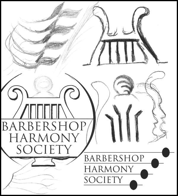
Figure 2
With a typeface chosen I began some visual brainstorming—doodling with pen and pencil, and playing around in Adobe Illustrator, just whatever happened to pop into my head without thinking about whether I liked it or not (figure 2). In the computer I tried different layouts of the Society's name, using some generic circles and squares as place holders. I tried drawing things in fours: four heads, four lyre strings, four mouths, and so on.
I first thought that it might be good to incorporate some element of the old logo into the new, to establish some continuity and recognition. So I sketched several new images of the lyre to see if it might fit into a new look. In the back of my mind, however, I knew I would not end up using the lyre. Since barbershop is fundamentally an a cappella style of singing, I knew that the use of an instrument of any kind would not be an appropriate representation of this art form.
Figure 3
The purpose of brainstorming is to spark ideas in the hope that something good will shout out and be noticed. At one point, with horizontal lines between the words, I stretched the lines to the left and placed the lyre over them, which kind of resembled a music staff and clef (figure 3). This semblance allowed the image to merely suggest the idea of music to the viewer—exactly what I was looking for. As luck would have it the name was only three words, allowing me to keep it from looking like an actual five-line music staff.
Figure 4
The trouble was that I still didn't want to use the lyre. I had to figure out something else to put there. So I turned back to the idea of making some representation of four people. I tried various combinations of shapes, but none of them gave the appearance of a clef. Finally I made a rudimentary shape of a face and copied it three times so that it looked like four faces beside one another (figure 4).
I liked the idea of four faces, but this thing looked like a quartet of Asimov's robots. So I began to doodle with a pencil, drawing face after face. They were quick and crude at first, but every now and then one would have a small detail that I liked. I didn't want something that looked exactly like a face, as if I had outlined a photograph of a man's profile. I wanted a stylized representation of a face, ideally in the calligraphic style of music notation symbols. Finally I drew one that I thought looked reasonably enough like a man singing and looked like something you would see in sheetmusic. I scanned it, redrew it in Adobe Illustrator, and refined its details until it had the look of a youthful, male singer (figure 5).
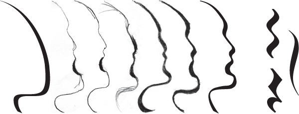
Figure 5
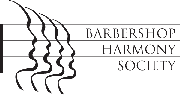
Figure 6
With this final image in the computer, I replicated it and made each successive face smaller to give a slight perception of depth. And with this, I finally had a distinctive mark to represent four men singing, and that could either stand on its own or be incorporated into a larger design (figure 6). To further enhance the resemblance to a staff, and to frame the image a little better I simply closed the left side with a thicker line.
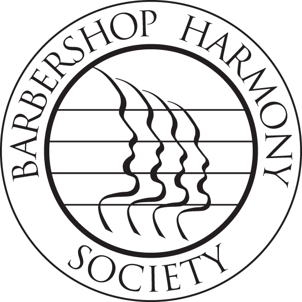
Figure 7
This made a fine informal logo for general use, but how could it be used on something like a gold medal or lapel pin? What I needed was a more formal version in a circular form, like a seal, that could be a drop-in replacement for the current Society logo. So I took the mark, put the name of the Society around it in a circle, and reworked it several times until I had a nice looking, circular version of the logo (figure 7).
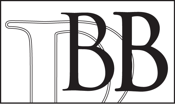
Figure 8
With the basic concept finally decided, I then needed to refine many aspects of the logo. The first problem with any logo in use today is to make it legible in small sizes and on-screen. As it was, the horizontal lines and the serifs of the letters were too thin for that. Thickening the lines was easy, but to make the serifs thicker I couldn't simply use the bold version of Trajan because it was too dark and the serifs really weren't much thicker than the normal weight, so it wouldn't solve the problem. So I had to expand the entire outlines of all the letters only slightly (figure 8), which made the serifs about twice as thick, but the letters minimally thicker. This allowed the letters to be much more legible at smaller sizes, without ending up as dark as the bold. Thickening the letters also somewhat alleviated the imbalance between the lighter text on the right and the darker, heavier graphic on the left.
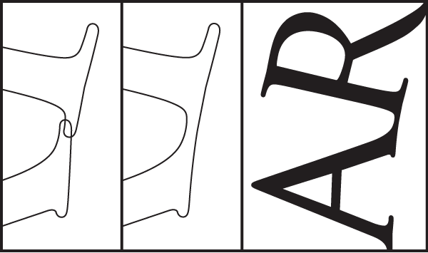
Figure 9
Those lines going through the faces were making it a little too muddled and confused, so I got rid of the lines between them. I then tightened up the spacing on the left and right sides of the faces and re-centered the words between the lines. After expanding the letters in the circular logo many of the letters ended up awkwardly overlapped. To make the curvature cleaner I combined those letters into single paths so that one letter gracefully flowed into the next (figure 9).
Figure 10
View the full proposal, and the Graphic Standards Manual
I was pleased with the final results (figure 10). They turned out to be clean, simple, and distinctive and satisfied all of the goals I had set at the beginning of the project. It could be used in a huge variety of applications and was, I thought, a classy representation for a classy Society. The board of directors agreed, and on January 30, 2005 voted for this to be the new official logo of the Barbershop Harmony Society.


Copyright © 2026 Daniel G. Delaney